behind the seen: liza & trey
I've been thinking about doing a feature like this for a little while now, thinking it might be kind of fun to start doing some behind the "seen" background stories of different designs; in particular, the wedding pieces I've been able to work on.
So here we are. Behind the Seen, post #1! I'm catching up with my brides a year-ish after their big "I do's," for thoughts and reflections on that sweet, sweet time and how the parapalla designed, printed pieces factored into the big picture.
First up in the interview spot?
The first bride I got to work with, my dear friend, Liza, and her husband, Trey.
Married in: Mobile, Alabama
Presently living in: Dallas, Texas
Liza & Trey, celebrating anniversary #1 with a fancy little staycation in Dallas.
a little background
How we met . . . I (Liza) had graduated from the University of Mobile, and Trey had just entered as a freshman (that's right . . . somewhat of a cougar). We had mutual friends. For months, we hung out in groups of people, and then one day something happened, and we were hanging out, just the two of us . . .
I knew there was something more to this relationship when . . . despite all my crazy and the many times I tried to push him away, he made the decision to pursue me daily.
He proposed . . . in his own perfect way. Trey came up with this very elaborate plan and proposed in front of the Chamber of Commerce in Mobile with a band made up of friends playing our perfect song, lights glittering in the trees and bushes, and some of our favorite people witnessing. Despite all of my snooping (and succeeding because I knew the day), it was perfect.
Shortly after he asked, and she said yes.
setting the tone
The creative process for the print pieces . . . Working with Michelle was a dream for me. Not only is she one of my dearest and most precious friends, but her work and vision exceeds any others. I sent Michelle several ideas of what I liked and we talked through them, narrowing it down to one idea and look (below).
Michelle was able to capture my thoughts and visions immediately. She was timely in getting drafts to me and patient when I would forget to respond with the changes when she needed me to. Michelle has such a creative spirit and her work is so beautiful. I have and will continue to recommend Michelle to anyone.
This was the beautiful retro-modern inspiration piece (found on Pinterest) we used as the jumping point for creating what Liza was envisioning.
When my invitations arrived . . . I was over the moon. They were exactly everything I wanted. That is one of those moments when the whole wedding seemed solidified and so very real.
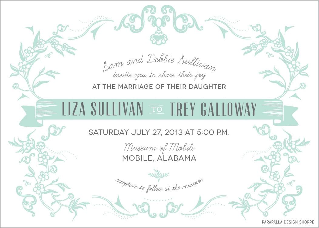
This was the final, and creating it was really fun! I tried quite a few fonts out (some seen in proofs below) before we landed on a final look. Creating the floral embellishments was a combination of piecing together a font as well as drawing specific elements in Illustrator to fill in the space appropriately.
This is the font I used and pieced together to design most of the framework around the text. Putting it all together felt a little like a puzzle with no picture to reference. It was fun to build!
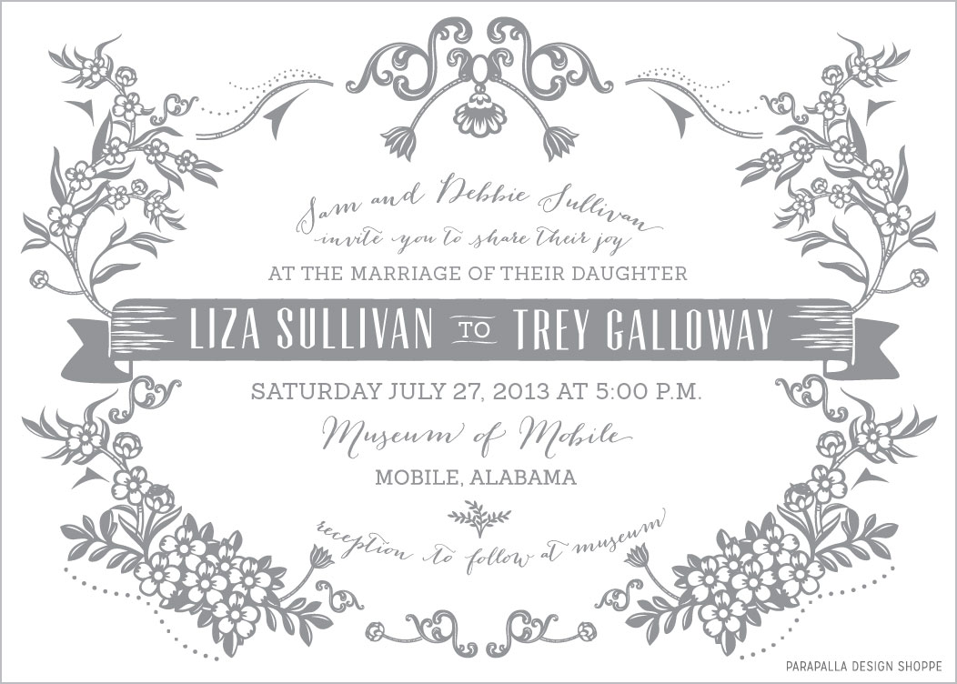
(These next three were all in the first round of proofs to help Liza fine tune her look. We took elements from a couple of these and put them together in the final.)
First proof 1 of 3 using a sans serif font and a thin script; in mint and gray on white
First proof 2 of 3 using a classic serif font (which turned out not to print well when sized that small) and a more full/friendly script; in gray and white on mint
First proof 3 of 3 using a slab serif font and a more modern script; in gray on white. This also includes thicker embellishments with slightly different variations.
that day
I wanted my wedding look and feel to be . . . anything but fussy. Trey and I wanted our wedding to be casual, laid back, and to truly reflect us. Every person that was involved in our wedding process was a person that was/is close to our hearts and that we have so much love and admiration for. From the handmade bouquets made of flowers picked up at the Farmers Market that morning, to the custom re-made wedding dress that was once my mom's, to the food that was all prepared by either my parents or close friends . . . it was a perfect reflection of us, and we couldn't have been happier with the outcome.
This is so very much, the animated and exuberant Liza we know and love, waking up on her big day!
With the bridal party in downtown Mobile
After photos, heading back indoors to the Museum of Mobile, where everything was being held
Liza really did want everything to be simple, and that extended to the text on the programs too. This was a front/back design--no middle section--simple, straight, and to the point. Unique to her style. I honestly laughed at first because I thought she was kidding, and then when I realized she wasn't, I laughed again because I loved the boldness of it! :)
The Mr. and Mrs., leaving the ceremony
So proud :)
Trey and Liza Galloway, July 27, 2013
All day-of photos beautifully snapped by Matt & Kristen of the 2654 Project.


